
Design trends come and go, but three visual styles keep resurfacing in UI conversations: glassmorphism, neumorphism, and skeuomorphism. Each promises a different emotional response from users, and each carries its own technical baggage. Picking the right one isn’t about chasing what’s fashionable on Dribbble — it’s about matching the style to your product’s personality and your users’ expectations.
Glassmorphism: Depth Through Transparency
Glassmorphism relies on frosted-glass panels, background blur, subtle borders, and layered translucency. It became popular after Apple leaned into it with macOS Big Sur and iOS design language, and it’s still everywhere in dashboards, fintech apps, and marketing sites that want to feel modern and airy.
Strengths:
- Creates a sense of hierarchy without heavy shadows
- Works beautifully with colorful, gradient-rich backgrounds
- Feels lightweight and premium
Weaknesses:
- Accessibility can suffer if contrast isn’t carefully managed
- Backdrop blur is computationally expensive on older devices
- Overuse quickly makes an interface feel busy rather than elegant
Glassmorphism suits products where visual polish matters more than raw information density — think onboarding screens, hero sections, or app widgets rather than data-heavy admin panels.
Neumorphism: Soft, Tactile Minimalism
Neumorphism (soft UI) emerged as a reaction to flat design’s coldness. It uses subtle inner and outer shadows on a monochrome background to make elements look like they’re extruded from or pressed into the surface. It looks stunning in static mockups, which is exactly why it went viral in 2020.
Strengths:
- Gives interfaces a calm, tactile, almost physical feel
- Monochrome palettes make branding colors pop when used as accents
- Looks exceptional in portfolio presentations and concept shots
Weaknesses:
- Low contrast often fails accessibility standards (WCAG)
- Buttons and disabled elements can look nearly identical
- Difficult to scale across large, information-dense applications
Because of these trade-offs, neumorphism works best in small doses — a toggle switch, a card, a music player widget — rather than as the foundation of an entire application.
Skeuomorphism: Familiarity Through Realism
Skeuomorphism mimics real-world objects — leather textures, stitched seams, glossy buttons, wood grain. It dominated early smartphone UI (think the original iOS Notes app or Calculator) because it helped first-time touchscreen users understand what was tappable.
Strengths:
- Intuitive for less tech-savvy or first-time users
- Strong metaphors reduce the learning curve
- Adds warmth, character, and personality to digital products
Weaknesses:
- Can look dated or cluttered if overdone
- Heavier visual assets may slow down load times
- Harder to maintain consistency across platforms and screen sizes
Today, pure skeuomorphism is rare, but its principles never fully disappeared. Modern interfaces borrow selectively from it — subtle drop shadows, realistic icon sets, or textured backgrounds — to add warmth without going fully retro. It remains genuinely useful in:
- Music production and audio software (knobs, sliders, faders)
- E-reading and note-taking apps referencing paper and ink
- Onboarding flows for non-technical audiences who need visual cues
Choosing the Right Style for Your Project
There’s no universal winner. The decision comes down to three questions:
- Who is your audience? Tech-savvy users tolerate abstraction; less experienced users benefit from skeuomorphic cues.
- What’s your performance budget? Glassmorphism’s blur effects can tax mobile devices; neumorphism is lighter but has accessibility trade-offs.
- How data-dense is the interface? Dashboards and analytics tools generally need higher contrast and clarity — something flat design or restrained skeuomorphism handles better than heavy glass or soft UI.
Many successful products actually blend elements: a mostly flat interface with occasional glassmorphic overlays for modals, or skeuomorphic icons within an otherwise minimal system.
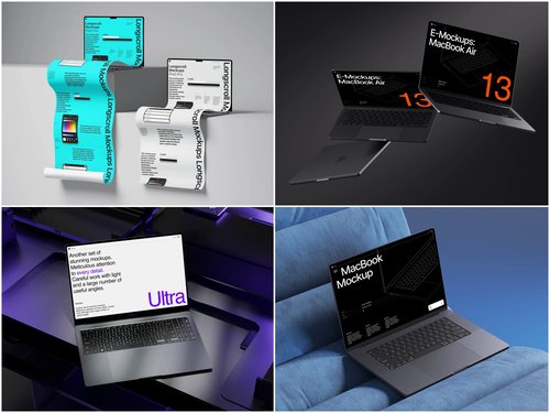
Real-Life Use of Laptop Mockups in Design Presentation
Whichever style you choose, presenting it convincingly matters just as much as the design itself — and laptop mockups have become a standard tool across several real-world workflows.
Portfolio case studies on Behance and Dribbble. Designers showcasing glassmorphic dashboard concepts almost always place their screens inside a Laptop mockup rather than posting flat screenshots. The reflective glass surface and realistic lighting make translucent panels and blur effects read correctly — something a plain PNG on a white background simply can’t convey.
SaaS landing pages and Product Hunt launches. Startups launching new dashboards or admin panels routinely feature a laptop mockup as the hero image on their homepage, since a browser screenshot alone looks unfinished, while a mockup instantly signals a real, shipped product.
Client pitch decks and stakeholder presentations. Design agencies embed laptop mockups directly into Figma or PowerPoint presentations when pitching a redesign. A neumorphic or skeuomorphic interface concept placed inside a realistic device frame is far easier for non-designers on a client’s team to evaluate than an isolated UI screen.
App Store and marketplace screenshots. Teams selling UI kits or templates on marketplaces like Envato or Gumroad use laptop mockups to demonstrate how a theme or component library looks in a real browser environment, which noticeably improves conversion compared to raw interface exports.
These aren’t hypothetical scenarios — they reflect how mockups are used daily across design portfolios, marketing pages, and sales presentations, precisely because context and realism sell a design far better than an isolated screenshot ever could.
Conclusion
Glassmorphism, neumorphism, and skeuomorphism each solve different problems: transparency and depth, tactile softness, or real-world familiarity. The right choice depends on your users, your performance constraints, and how much visual complexity your interface can handle. Whatever direction you take, presenting the final design matters as much as designing it — and resources like ls.graphics make it easy to frame your work in realistic device contexts, helping clients and users see the design exactly as it will look in the real world.